Tiling Typography
A series of four typographic studies placing classic typefaces over mathematical tiling patterns.
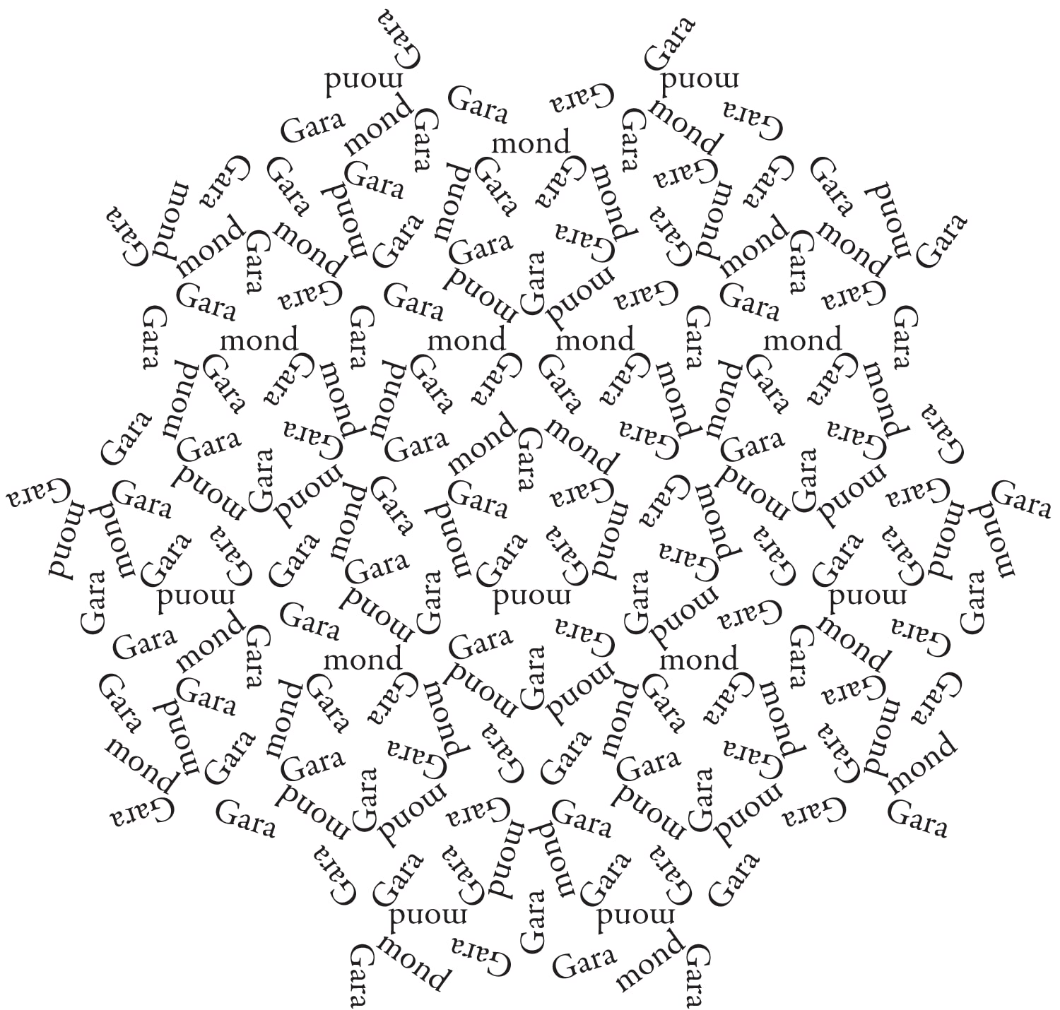
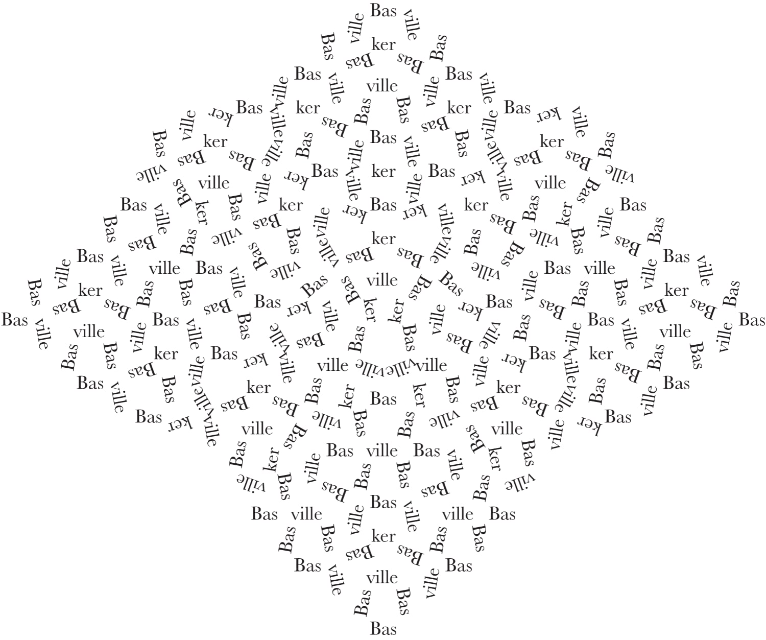
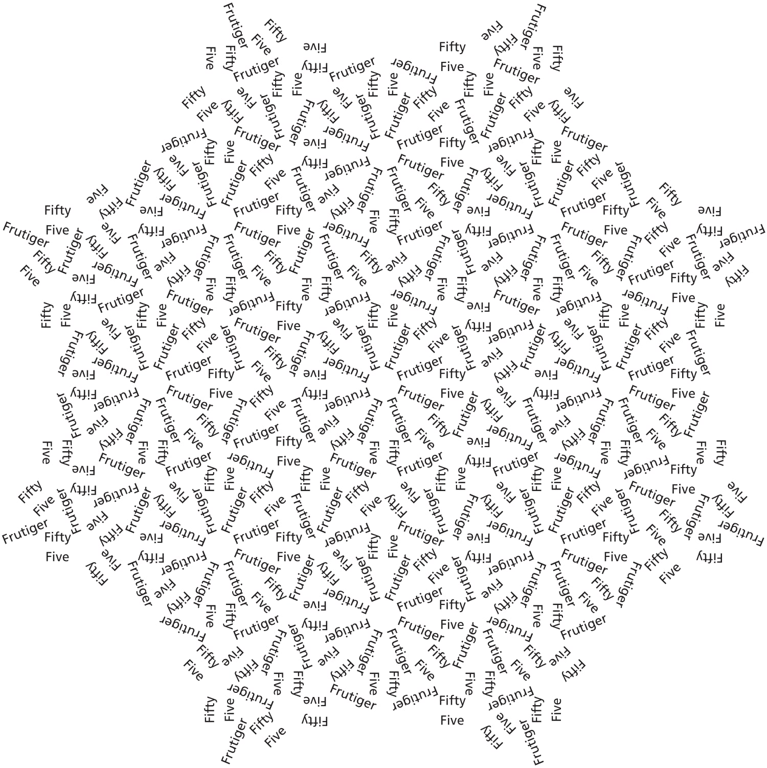
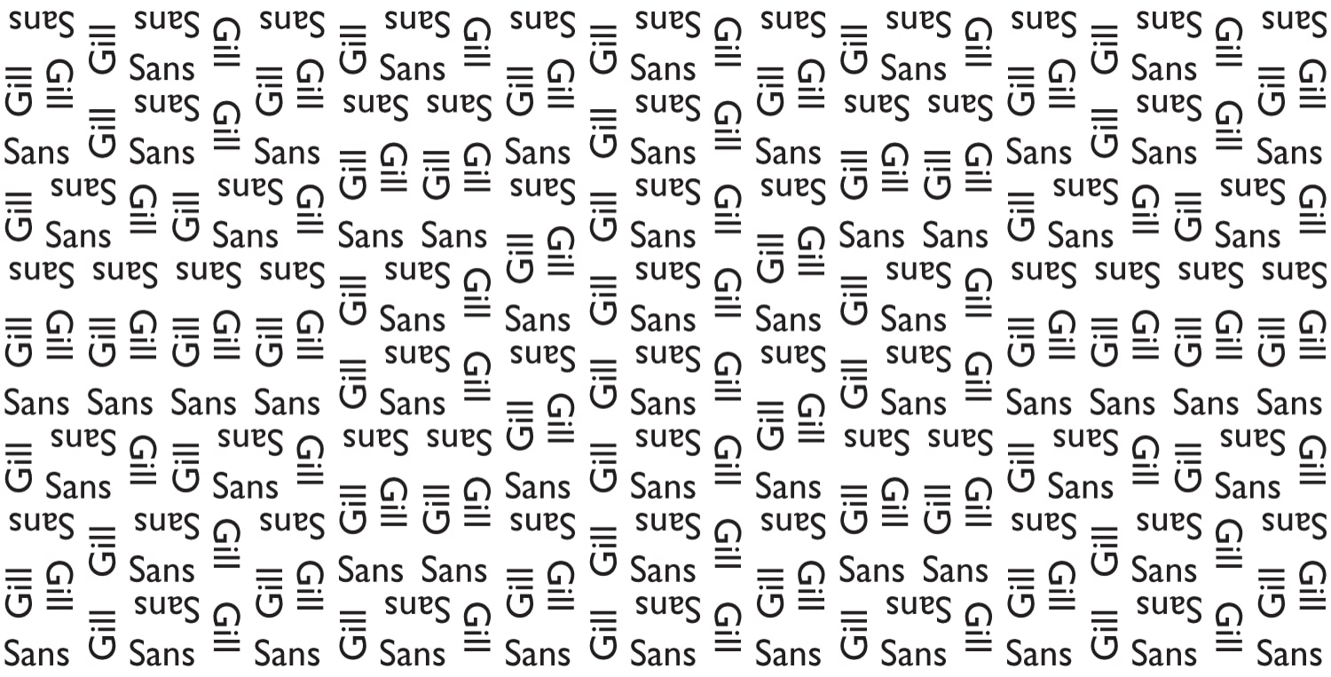
Each composition pairs a typeface with a tiling whose geometry echoes something in the letterforms: Garamond’s classical curves against the five-fold Penrose; Baskerville’s sharp serifs against the nine-fold rhombic grid; Frutiger’s rational geometry against the Ammann–Beenker’s eight-fold order; Gill Sans’s humanist strokes against a domino tiling.